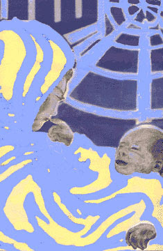
[I'm looking for a better JPG of this. When I find it I'll switch this one out with it.]
In early November 1995 Real Change was planning to make the next December's issue about women. On the other hand, it would be the Christmas season. Plus, we were going to run a poem by Anitra Freeman called
Quantum States of Mary. So Director Tim Harris said he wanted a Madonna and Child image for the cover.
I jumped in and said that 12 years earlier, during my worst bout of homelessness, at Blessed Sacrament Church in Seattle, I had looked over the shoulder of a Korean woman as she held her baby and saw him smile and reach for her lips. The image had seared into my mind and I'd wanted to paint it all these years, and now I felt I was ready. So Tim said go for it, but don't take too long because if I can't use what you give me I'll have to find something else.
It took less than a week. The basic model for the baby was one of my own baby pictures. The mother was done from memory. It was acrylic on 9" by 12" canvas board.
The original sold before I could scan it. In the original the mother's cloak was approximately the color shown, the background was blue and gold, the baby's blanket was China red, and the faces and hands were tinted. We couldn't do that many colors back then so Tim converted the blue, gold, and red to the two shades of blue, and did the faces and hands in gray scale. The image above is what resulted before the Real Change logo and front page headlines were added (in the space deliberately provided in the design.)


